Built in 1921, this Craftsman Style house although modest, boasts tons of style and character that you would come to expect from this period. Strangely, what was of particular attraction to the Owners was the unfinished basement with its 7’-4” ceiling height, a somewhat uncommon circumstance for a house of this age.
Over the years of ownership, the unfinished basement became home to an additional bathroom, a laundry room with the household recycling, and a very ample office area for the Owners business, leaving about a third of the remaining area as an unfinished and unorganized storage and mechanical space.
To create the illusion that this remaining area was not unfinished, a handsome, sand cast glass, Frank Lloyd Wright influenced pocket door was installed separating the spaces. As the family grew, more space was eminent and ideas of finishing off the rest of the basement became more a need than a want.
The plan was to install a few walls to hide the furnace and water heater, close off and organize an area for seasonal storage, and provide easy access to the gas and water meters. This would make for a decent sized room of about 16’ x 18’ for a nice family room that could handle the kids, some comfortable furniture, and another TV and, it would be fairly inexpensive to finish off. The goal was to keep it in the architectural context of the rest of the house, nothing fancy, and shoot for a budget of around $20,000.00. That was the plan.
The initial design did just that. It then was suggested that it might be nice to have a little area with a small fridge, a microwave, and a small sink. That was easily worked in, and it did not really encroach on the useable floor space. The cost of this was not going to be crazy expensive with stock cabinetry and a laminate counter top. That too was designed into the new space.
As the new plan came together, thoughts of furniture placement dictated that the 8”x8” wood column supporting the 10”x10” wood beam the first floor joists rested upon, (which happened to intersect the middle of the room), had to go. An engineer’s calculations determined that the post could go and 4ea 11-7/8” micro lams, 2 to each side of the wood beam, would be necessary for the 17’ span. These would be supported by 4 – 4” steel columns resting on a combination of footings on one end, and ½” steel plates on the other.
The question was asked, now that the floor area was wide open, could the plan somehow eliminate the full sized doors that were designed to access the water meter and clean out on one side, and the gas meter on the other? If so, a little bit more room would be gained. Each of these items required an appreciable amount of room to get at, and above the water meter was crawlspace access to the sunroom at the front of the house. That was the intention of a full sized door in front of the water meter and cleanout area, in the event access to the crawl space was ever necessary. The Owner rationalized that in 11-years since the crawl space was sealed off, there has never been a need to get into it. They could not see why there would be a need to in their future.
To address this issue, the wall along this area was angled to the tightest degree possible allowing for the meters and floor cleanout being immediately behind the studs. The walls were framed in such a
manner that only one stud above the water meter had to be removed, and one below the ceiling to access the crawl space. In turn, 2 – 14”x 29” flush plastic access panels were installed that would be textured and painted the same as the drywall making them indiscernible while still providing access to all of these items.
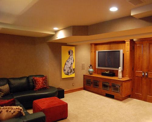
Next, the discussion regarding the placement of the TV. While shopping for a new television for the space, the Owner discovered that large screen TV’s we much more affordable than they had thought. In addition, if you are going to have a large screen to watch movies on, you should have large sound to complete the experience. Any idea of taking up already precious floor space with 7 plus speakers was not appealing. The focus was now placed on installing speakers into the walls and ceiling where possible. With this, came the thought that the floor joists above should be insulated to dampen the sound. R-19 insulation was added.
It was decided a 60” television would suit the space just fine and one was purchased but, trying to find something to put the TV on and store all the components became another experience. The TV salesperson suggested that for the layout, the best installation for the TV was to wall mount it. That however, meant that the Owner would see all of the wiring and the bracketry from the side of the unit when it hung on the wall. They did not like that idea.
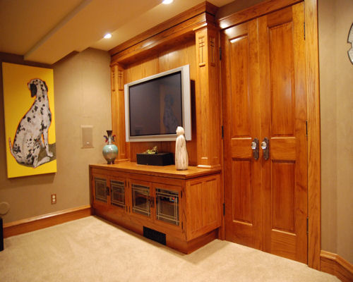
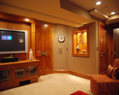
On the wall that the TV was designated to go on, the Owners could not find furniture that would house all of the a/v components and would be in proportion to the wall space that appealed either in cost, or function. A custom base cabinet and wall ensemble was designed to address all of their concerns. For the Owners, this had to have character and detail befitting of the first floor with leaded glass doors, period hardware, inlays, and crown molding just like the other built-ins in the house.
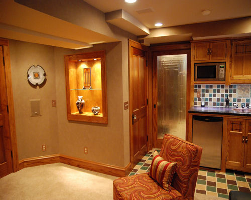
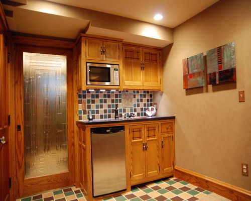
Of course, stock cabinetry for the kitchenette area would no longer do, and something had to be done with the white vinyl, awning window that was in the space. It was not allowed to come out, it matched all of the other basement windows from the outside. We were challenged to make it look like wood and give it character as well. We veneered it with Oak, replaced the hardware, and constructed a Craftsman Style, Oak, grille to fit over the interior glass of the sash. The Owner, so taken by the grille design wanted the concept incorporated into the kitchenette cabinetry in some manner. We did so with exotic wood inlays.
The kitchen and entertainment center incorporates both Blood Wood and Ebony inlays, all of the cabinets have oil rubbed Bronze, ball tipped finial hinges, and hand hammered Copper hardware pulls. The counter top for the kitchenette base cabinetry now had to be something different than laminate. Concrete, stained to resemble mottled leather is installed. A hammered Copper sink with oil rubbed Bronze faucetry with porcelain handles is placed onto the concrete counter top of the custom cabinetry.
The Owners salvaged an Ernst Batchelder mosaic tile of a pair of swans from a previous renovation involving the removal of a faux fireplace in the house and asked that it be included in the design along with handmade Arts and Crafts tiles they located that matched those of their sunroom floor. All were incorporated into either the backsplash, or the floor of the kitchenette area. The tiles were very difficult to work with because of their inconsistent and random widths and thicknesses, but that was the look to achieve along with the wide, 3/8” grout joints.
Placing the entertainment center along the full span of the TV wall covered the wall space for the cold air return, as such; it was then brought through the cabinet toe kick instead.
The main trunk supply and branch ducting was consolidated as was the main gas line to be as close to the micro lams as possible. A soffit was constructed with angles to match the same degree of the two wall angles that were built around the mechanicals and structural framing.
The lighting is designed to eliminate the need for floor lamps while allowing for precise level control depending upon the activity or mood, and to provide illumination for the Owners artwork. Under cabinet, dimmable, led lighting is installed beneath the upper cabinets, and Xenon lights with 2 levels of intensity are installed in the base of the entertainment center.
All of the cracks and imperfections of the concrete floor are filled with latex fortified topping cement, and the floor was sealed with a urethane masonry sealer before the installation of the carpet and pad.
To complete the look and feel of this Craftsman Styled renovation that took on a life of its own, all of the hinged passage doors have oil rubbed Bronze, ball tipped hinges, crystal knobs and Bronze back plates, and the switch and outlet covers are hammered Copper, (to match the sink and the cabinet pull hardware).
There still is room on the walls for some additional artwork, and were told the kids and their friends have to take off their shoes when they are allowed to use their parents new room.

